

 Shimul Chowdhury
Introduction: Setting the Stage for User-Friendly Website Design
When it comes to creating a lasting digital impression, few things are as important as your website’s design. The average user spends mere seconds deciding whether they’ll stay on your site or move on, meaning that first impression matters more than ever. But what sets successful websites apart from those that fail to engage? It’s all about user-friendly website design.
At its core, user-friendly website design is about ensuring that every visitor can navigate your website with ease, find relevant information quickly, and interact seamlessly with your content. It prioritizes accessibility, usability, and aesthetics to provide an exceptional experience. In this blog, we’ll uncover 12 secrets that will transform your site into a user magnet, but first, let’s dive into why user-friendly design is the foundation of success.
Why User-Friendly Design Matters
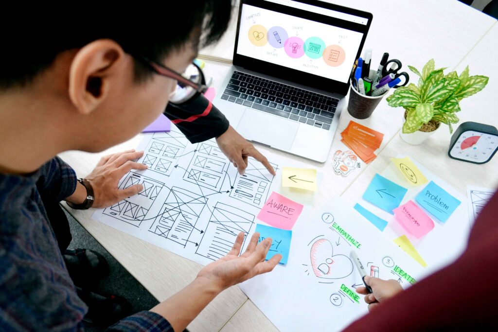
A user-friendly website doesn’t just delight visitors—it has tangible business benefits. Here’s why you should prioritize it:
- Lower Bounce Rates: Sites designed with the user in mind often experience reduced bounce rates. If visitors can easily locate what they’re looking for, they’re more likely to stick around and explore.
- Higher Conversions: A seamless experience encourages users to complete desired actions, such as signing up, purchasing a product, or contacting your team.
- Mobile Compatibility: Over 60% of web traffic comes from mobile devices. If your site doesn’t work well on phones, you’re losing a lot of visitors.
- Improved SEO Rankings: Search engines like Google reward user-friendly websites with higher rankings. Features such as mobile responsiveness, fast loading times, and intuitive navigation all play a role in boosting your visibility.
- Trust and Credibility: A polished, easy-to-use website builds trust among visitors and positions your brand as professional and reliable.
Here’s a powerful fact: 94% of first impressions come from how your site looks. It’s clear that investing in user-friendly website design isn’t just optional—it’s essential.
By focusing on these foundational principles, your website can become a powerful tool that not only attracts users but also converts them into loyal customers. Ready to dive deeper? The next section will explore how intuitive navigation can make or break your website experience.
Clear Navigation Structure
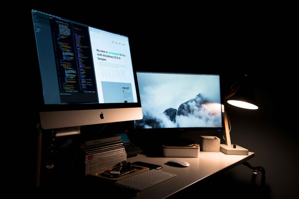
One of the most critical aspects of user-friendly website design is ensuring your site’s navigation is intuitive and straightforward. Think of navigation as your website’s roadmap—without clear directions, visitors can easily get lost or frustrated, leading to higher bounce rates.
Here’s how you can produce an clear and easy-to-use website menu:
- Keep it simple: Use clear menu names and don’t give users too many choices.
- Consistency matters: Maintain a consistent navigation style across all pages to help users feel oriented and confident while exploring.
- Utilize dropdown menus wisely: Organize related content under dropdown menus to avoid cluttering your homepage while still providing easy access to essential information.
- Internal linking strategy: Implement internal links to guide users toward other relevant pages on your site. Not only does this improve navigation, but it also benefits your SEO by boosting site authority.
- Sticky headers: Consider adding sticky headers, allowing users to access your navigation menu as they scroll through content.
For example, imagine visiting an online store where categories like “Men’s Clothing” and “Women’s Accessories” are mixed randomly with no logical grouping—it’s confusing and frustrating! A clean, structured menu allows visitors to locate what they need without extra effort, leaving them with a positive impression.
Ultimately, clear navigation makes your website feel professional and welcoming, two essential qualities of user-friendly website design. Now, let’s explore another critical element: responsiveness and mobile-friendliness.
Responsive & Mobile-Friendly Layout
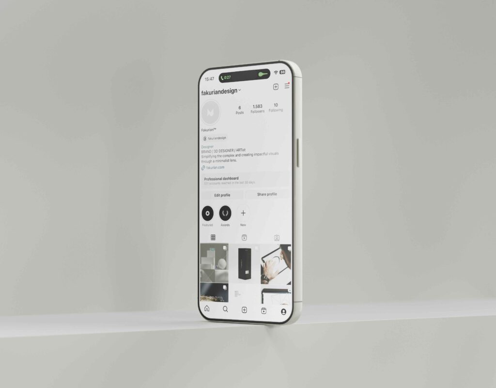
In today’s digital landscape, responsiveness isn’t optional—it’s a necessity. Over 60% of global web traffic now comes from mobile devices, making mobile-first design an integral part of user-friendly website design.
Here’s why a mobile-friendly design is important and how to make one.:
- Adapts to various screens: A responsive layout ensures your website looks and functions perfectly on devices of all sizes, whether it’s a smartphone, tablet, or desktop.
- Enhanced usability: Mobile-friendly websites allow users to scroll, zoom, and click effortlessly, creating a smoother experience.
- Improved SEO performance: Google prioritizes mobile-friendly websites in its search rankings, meaning a responsive design can help increase your site’s visibility.
- Reduced frustration: Nobody enjoys navigating a desktop-centric site on a phone. A bad mobile experience can make people leave your site right away.
Want to test your site’s responsiveness? Use tools like Google’s Mobile-Friendly Test to see what needs fixing.
Additionally, consider these tips:
- Use fluid grids and flexible images to ensure elements resize dynamically.
- Prioritize fast loading times for mobile users by compressing images and minimizing heavy scripts.
- Don’t use Flash—it’s old and doesn’t work on most devices.
- Optimize your touchpoints, such as buttons and forms, for finger taps instead of clicks.
Creating a responsive and mobile-friendly layout isn’t just good design—it’s a key factor in attracting and retaining users. By focusing on this element of user-friendly website design, you’ll ensure your visitors have an exceptional experience regardless of how they access your site.
Fast Loading Speed

When it comes to user-friendly website design, speed is the main element of focus. A website that takes more than 3 seconds to load can frustrate users and lead to abandonment, significantly affecting engagement and conversions. In today’s fast-paced digital world, People want websites to load fast, so speeding up your site is key.
Why loading speed matters:
- Improves user experience: A fast-loading site enhances visitors’ experience, ensuring they can quickly access the information or services they need.
- Reduces bounce rates: Slow-loading pages can drive users away, leading to higher bounce rates. On the other hand, faster websites keep people on your site longer.
- Boosts SEO rankings: Search engines, especially Google, favor websites with quick loading times, which means your site is more likely to rank higher on search results.
- Increases conversions: Whether it’s completing a purchase or signing up for a newsletter, faster sites encourage users to take action.
Tips for optimizing your website’s speed:
- Use lightweight themes and templates to reduce unnecessary load.
- Consider performance plugins like WP Rocket or W3 Total Cache if you use WordPress.
- Regularly check and audit your site’s speed with tools like Google PageSpeed Insights.
Remember, every second counts in keeping your users satisfied. By prioritizing speed, you’re one step closer to achieving an exceptional user-friendly website design.
Readable Typography & Visual Hierarchy

A website that looks good and is easy to read is key to being user-friendly website design. Typography and visual hierarchy play a key role in ensuring visitors can quickly digest and understand your content, guiding them naturally through your site.
Main benefits of easy-to-read text and clear design:
- Enhanced comprehension: Clear fonts and logical layouts make it easier for users to grasp information quickly.
- Improved engagement: Organized content encourages visitors to explore your site further rather than feel overwhelmed.
- Better accessibility: Thoughtful typography ensures that users of all backgrounds, including those with visual impairments, can interact with your site.
How to improve typography:
- Choose legible fonts: Avoid overly decorative fonts; instead, opt for clean and professional options like Arial, Helvetica, or Roboto.
- Use appropriate font sizes: Ensure body text is large enough (16px minimum) to read comfortably on all devices.
- Maintain proper spacing: Use good line spacing (about 1.5 times the font size) and margins to avoid a crowded look.
How to create a visual hierarchy:
- Utilize headings and subheadings: Organize content into sections with clear headings to guide users efficiently.
- Apply contrasting colors: Make sure the text stands out from the background to improve readability.
- Break content into chunks: Divide paragraphs into bite-sized pieces, making them less intimidating and easier to skim.
- Leverage white space: Allow breathing room around content to prevent visual overwhelm and create a polished look.
Readable typography and visual hierarchy work hand-in-hand to ensure your site is user-friendly and visually engaging. By focusing on these principles, you can provide an enjoyable browsing experience that leaves a lasting impression on visitors.
Consistent Branding
A cohesive and recognizable brand identity is a hallmark of user-friendly website design. Consistent branding not only builds trust but also enhances user experience by presenting a unified and professional appearance across all pages.
Why consistent branding matters:
- Builds credibility: A well-branded site conveys professionalism and reliability, making users feel confident about engaging with your business.
- Enhances brand recognition: By using the same visual elements consistently, users can easily identify your brand, whether online or offline.
- Improves user experience: Consistent visuals and messaging reduce confusion, allowing users to focus on what your site offers.
How to achieve consistent branding:
- Uniform color palette: Choose a cohesive set of colors that represent your brand and use them throughout your site.
- Typography alignment: Stick to a small selection of fonts that align with your brand’s style—this creates a polished and professional look.
- Consistent imagery and icons: Use images and icons that match your brand’s tone, whether modern, playful, or traditional.
- Logo placement: Feature your logo prominently, such as in the header and footer, to reinforce brand identity.
- Tone of voice: Maintain a consistent tone and style in your website content, whether it’s friendly, formal, or informative.
For example, think of globally recognized brands like Apple or Nike. Their websites reflect their branding seamlessly, creating a user-friendly and cohesive experience that reinforces their identity. By focusing on consistent branding, your user-friendly website design will resonate with users and leave a lasting impression.
Regular Maintenance & Updates

A website that is out-of-date or riddled with errors can severely impact user experience, which is why regular maintenance is a crucial component of user-friendly website design. A well-maintained site not only ensures optimal functionality but also keeps your users happy and engaged.
Why maintenance and updates matter:
- Enhances security: Regular updates help protect your site from vulnerabilities, safeguarding both your data and your users’ information.
- Improves performance: Addressing technical issues like broken links or slow load times ensures smooth navigation and fast responses.
- Keeps content relevant: Updating your content regularly keeps your site fresh and useful for visitors..
- Boosts user trust: A well-maintained site signals professionalism and care, building confidence among users.
Tips for maintaining your website:
- Conduct routine checks: Regularly test your site’s functionality, including forms, navigation, and links.
- Update plugins and software: If your website is built on a platform like WordPress, keeping plugins and themes updated is essential for security and performance.
- Backup your site: Schedule regular backups to protect your data in case of an unexpected issue.
- Monitor loading speed: You can use tools like Google PageSpeed Insights to identify and address performance issues.
- Check for broken links: Tools like Dead Link Checker can help you identify and fix any non-functioning links on your site.
Regular maintenance also gives you an opportunity to refine and improve your user-friendly website design over time. Think of your website as a living entity that requires consistent care to thrive. With proper maintenance, your site will not only meet user expectations but also exceed them, ensuring long-term success.
Common Mistakes to Avoid
No matter how well-designed your website may be, even small missteps can ruin the user experience and detract from an otherwise user-friendly website design. Recognizing and addressing these common mistakes can help you avoid pitfalls that frustrate visitors and drive them away.
One of the most glaring errors is an overcrowded layout. Websites that are too cluttered with text, images, or ads can overwhelm users, making it difficult for them to focus on the content that matters. Without a clear visual hierarchy, the site feels chaotic, making it hard for users to know where to focus or what to do. A user-friendly website design avoids this by using clean, organized layouts that prioritize key elements and guide users naturally through the page.
Another mistake that plagues many sites is autoplay videos or intrusive pop-ups. While these features might seem like clever marketing tactics, they often disrupt the user’s experience. Unexpected sounds or videos can surprise visitors, and too many pop-ups can overwhelm them. Instead, it’s better to offer controlled interactions, such as giving users the choice to play videos or displaying pop-ups sparingly and at appropriate moments.
Mobile-unfriendly designs are another critical issue. With the majority of web traffic now coming from mobile devices, a site that doesn’t adapt to smaller screens alienates a significant portion of its audience. If your site isn’t responsive, users may struggle with navigation, excessive scrolling, or unreadable text, leading them to abandon your site in frustration.
Finally, slow loading speeds quietly drive away visitors. Visitors expect a seamless browsing experience, and even a few seconds of delay can make them lose interest. Neglecting to optimize your website for speed undermines your efforts to create a truly user-friendly website design, as users prioritize convenience and efficiency above all.
By avoiding these common mistakes, you can ensure that your site remains welcoming, functional, and enjoyable for all visitors.
How Zeireed Can Help You Build a User-Friendly Website Design
Creating a website that is intuitive, engaging, and accessible is no small feat. That’s where Zeireed steps in as your partner in crafting an exceptional, user-friendly website design. With a focus on blending creativity and functionality, Zeireed can help you design a digital space that not only attracts visitors but keeps them coming back.
Zeireed starts by understanding your unique goals and audience. With expertise in user-centric design principles, they ensure your site caters to your target audience’s needs. Their approach includes designing intuitive navigation, optimizing layouts for mobile responsiveness, and ensuring fast loading speeds. Each element is tailored to create a seamless experience that enhances both usability and engagement.
Accessibility is a key part of Zeireed’s services. They incorporate alt text, accessible forms, and keyboard navigation into every design, ensuring that your website is inclusive to all users. Being inclusive helps you reach more people and shows what your brand stands for.
Moreover, Zeireed specializes in creating visually cohesive and professionally branded websites. Aligning the color palette, typography, and overall tone with your brand identity helps you build trust and recognition among your audience. Their designs reflect the perfect balance between aesthetic appeal and functional efficiency, ensuring your site stands out in a crowded digital landscape.
Beyond initial design, Zeireed also offers comprehensive maintenance and support. From updating plugins and software to optimizing performance and fixing technical issues, they ensure your site remains up-to-date and fully functional at all times. This proactive approach allows you to focus on your business while leaving the technical details in expert hands.
Whether you’re looking to launch a new website or revamp an existing one, Zeireed’s expertise in user-friendly website design makes them the ideal partner for your digital journey. Let Zeireed change your online presence into a user-friendly experience that makes a lasting impact.
Conclusion
Crafting a user-friendly website design isn’t just about implementing individual elements—it’s about creating a seamless experience where every feature complements the user’s journey. A website that’s easy to navigate, visually appealing, accessible, and regularly maintained is a digital space where users feel valued and comfortable, driving them to engage further.
Reflecting back on the key principles we’ve covered, it’s evident that consistent branding, accessibility, intuitive navigation, and fast loading speeds all contribute to a successful website. The secret to a winning design lies in understanding the needs and behaviors of your audience and delivering a platform that caters to their expectations.
Your website is your virtual storefront, and like any good business, it needs regular audits and updates to stay relevant. Take the time to evaluate your current site against the principles of user-friendly website design and identify areas for improvement. This way, you can turn your website into a tool that not only draws in visitors but also keeps them and turns them into customers.
Empower Your Website with Zeireed
Is your website optimized for user experience? If not, it’s time to take action. Let Zeireed help you apply the principles of user-friendly website design to elevate your digital presence. With expert guidance on responsive layouts, accessibility, branding, and more, Zeireed is your trusted partner in building a website that works smarter, not harder.
Contact Zeireed today to get started on crafting a website that keeps your users happy, engaged, and coming back for more! Together, let’s make your site a true masterpiece of functionality and design.